… and the Bay City Rollers are excited.
The first Saturday in November is Desaturate Day, as everyone knows. Well, everyone not living under a rock with worm tunnels between their ears, anyway. And thus I’m here to inspire you to wash out, go drab, and reduce it all down to black and white, because everything is simpler that way – for a given definition of “simple,” at least.
Not a lot of the photos that I’ve taken in the past six months or so really do well when converted to monochrome, but I scared up a couple, with some older entries for seasoning.
We first saw our friend here back in September, and the original was pretty monochromatic in itself, though not in the way the term is normally used. I mean, technically, none of the photos in this post are chromatic in the slightest, they’re simply brightness values, but ‘nonchromatic’ isn’t in regular use – some dictionaries don’t recognize it at all, so we use a term that means “one color,” as if black, or white (I’m not sure which one is supposed to count,) is a color. It’s insulting to pedants, really.
Anyway, this version of the photo was done with channel clipping, a mix of the green and blue channels with a contrast tweak to make the most of the range. We’ll return to this particular practice later on.
How about another version of the Midmonth Abstract from just a few weeks ago?

Because the original was primarily blue, selecting just the blue channel for this one rendered the foggy lake as an indistinct void for a nicely surreal affect, that a little tweak in Curves enhanced. It would have been nice to get just a hint of grey from the colors of the leaves, but this would have required much more selective level controls, practically the same as dubbing in elements from another frame, so I let it go; the near-black leaves and branches work well enough against the encroaching nothingness. True to form, the blue channel was a bit muddy and this shows, but I think it lends a dreamlike quality to it. Yeah, it’s perfectly intentional, that’s it…
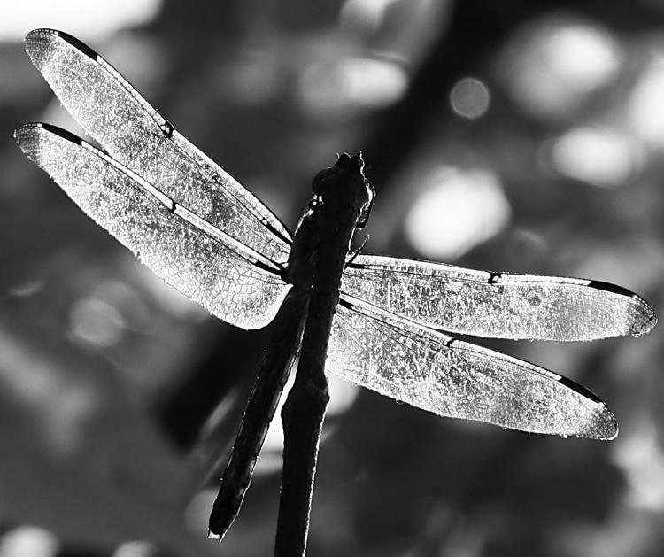
We also saw this one earlier, here, and the contrast levels obviously lent themselves to this treatment. But this is channel clipping again, just the green channel because it brought out the darker wingtips; the red channel had them almost the same brightness as the rest of the wings, and the blue channel was simply too dark and muddy.
Let’s have a (more or less) natural monochrome.
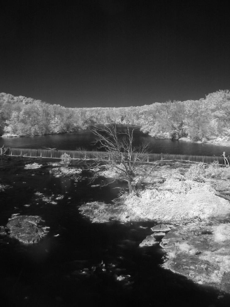
You may recognize this as infra-red, mostly from the bright foliage and black sky, and what I liked most about it were the brilliant white leaves on the little island, much more reflective of infra-red wavelengths than the trees nearby. This might have had something to do with it being October (back in 2006, not last month,) with the trees starting to become less green – or it might not, since I’ve seen fallen leaves still reflecting a lot of IR. Either way, I liked the starkness, increased here of course, but I would have preferred that bare tree to have been more prominent and isolated in the frame – since this was taken from a highway overpass, my options were pretty limited. And it might seem at first that I had problems with leveling the camera, but it’s fine, as a look at the horizon will confirm – the spillway runs at an angle to the road, so that’s the bit that’s not ‘level.’
Back to this year, when the early morning sunlight and some coarse textures lent themselves to the ol’ noir treatment.
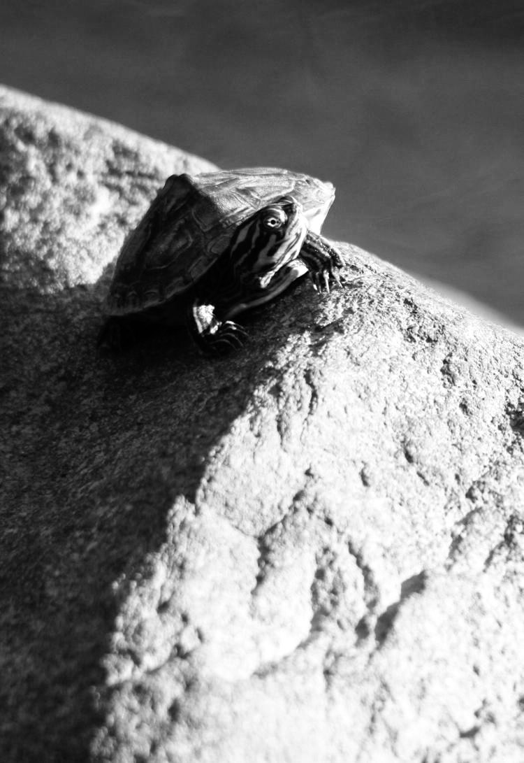
This is another just-green-channel image, which worked best for the contrast; the red channel was lower contrast than this, while the blue channel (being the opposite of yellow) rendered most of the colors within as too dark overall. Most especially, that eye was a necessary element, but having the stripes and the carapace textures in the shadows provided more detail and depth.
I did these next two quite some time back, and never posted them because I couldn’t decide which worked better, so now I’m cheating and posting them both.
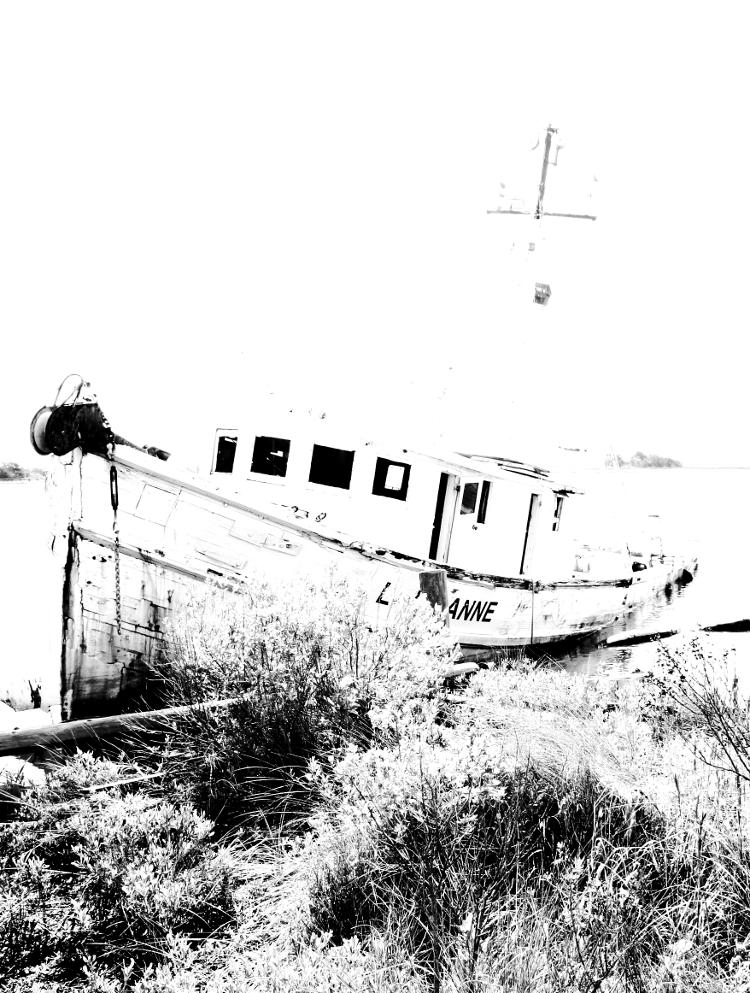
We hunted down this shipwreck (okay, it’s more likely just abandoned) last year during a beach trip, but I didn’t quite get the appearance I was after with the direct approach, so later on I went the extremely high contrast route, which is an improvement, but I’m still unsure. There are two versions.

These were both done using a technique discussed back on another holiday, yet what probably would have worked better would have been trees (or some horizon element) behind the roof of the wheelhouse instead of open sky. But that’s something for painters to chase – photographers can only take what’s there. Mostly.
It’s autumn, right? So it’s time for some autumn, um, monochrome…
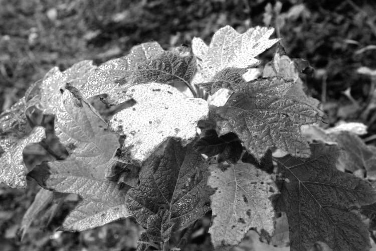
Okay, definitely barking up the wrong tree here (because this is not even a tree,) but this is the season for foliage colors, and the original was a fine example, so what am I doing converting this to greyscale? If we could answer that, it all might click into place. Doubtful, of course, quite a long shot actually, but the possibility exists.
Still, the contrast between the colors came out nicely. I forget what I did for this one (it was a while ago,) but it’s likely just the red channel.
Yet another, from deep in the mists of time.
Let’s face it: this one looks good in both color and greyscale, and would look good no matter what I did to it – it’s that badass. I’d buy a giant print of this myself, if I wasn’t the one that had taken it. That it hasn’t produced my fortune yet is just evidence that too many people aren’t very bright, but then, we already knew that.
[Did you like that subtle little manipulation? I pretty much said, “Only stupid people wouldn’t buy this.” That’s slick marketing, that is.]
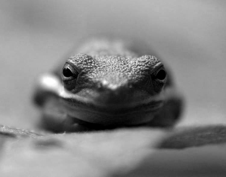
Finally, we return to the green treefrogs, because damn I shot a lot of them this year (good eatin’ through the hard winter months.)
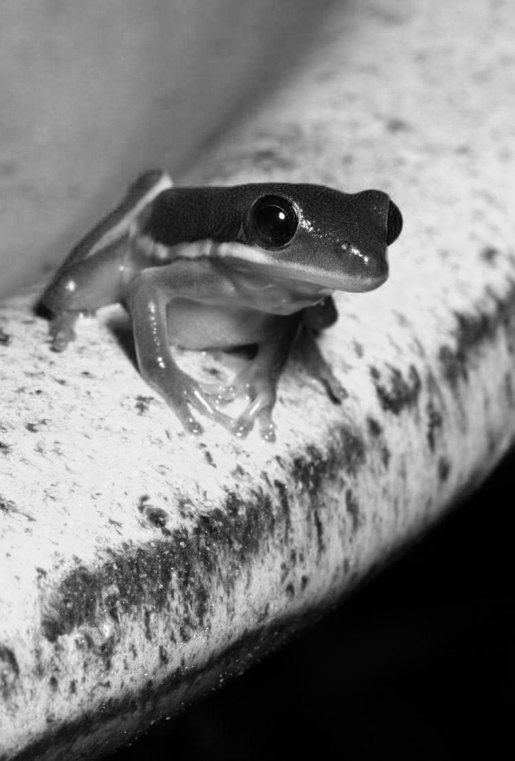
Referring back to the original, you can see that the birdbath was a bright blue, which definitely begged for the channel-clipping treatment, but when examined, the blue channel was actually overwhelming, rendering the frog too dark while the birdbath was almost solid white. So I kept the green channel too, and adjusted the opacity of that to blend them together (like the first frog at top,) until I got the contrast that I wanted. Without seeing the original, it’d be easy to believe the birdbath was white and this affected the exposure to darken the frog, but no, we’re only talking crass editing tricks here. But if it works, it works, and I’m not going to claim this is Kodak Tri-X or anything – hey, I own up to my editing efforts.


